A CLOUD OF SPRAY MADE OF METALS.
September 16, 2021
#DONTTOUCHMYCLOTHES
September 30, 2021In this article, I will bring the topic of Coolhunting once again, but now I’m going to present it in a practical and applied way. I did it during this summer because I was working on a project about Diversity & Inclusion in architecture, and I could not lose the chance to pick up some cool signs and references from one of the most iconic cities in terms of architecture in the world: Rotterdam. As unfortunately it was almost destroyed in World War II, the city was built again but this time with disruptive and modern architecture.
Although I strongly advocate for people to disconnect during vacations, there is a part of me that never sleeps: my coolhunter soul! 😛 I have said in my articles here that I believe once you start seeing life with “Trend’s lens” you will not be able to take them off anymore. And for me, that was the perfect occasion to use them, because I was aware, conscious, attentive, curious enough, and in the perfect spot.
Before I share with you what I found, I would like to advise you to look further from the content itself. More than the examples I bring, I want you to pay attention to why and how I did it, how I presented it, the kind of interpretation I gave to it, and the kind of topics, signs, cases, brands I related to everything. I would like this to be inspiring enough for you to try this in any context of your life, personal or professional. You could use it to simply show your ideas and findings from a trip with friends or just from a walk in your neighborhood, inside or outside your company. Anywhere you go you can do a Coolhunting, but the way you present it is going to be a watershed for the perception of the content as something innovative, valuable, and deep, or just another hype.
By doing this you will avoid thoughts and comments like “Oh yeah, another hipster thing with buzzwords that someone is using to look cool”. Instead, you will have the chance to analyze it in-depth and come up with meaningful content that is what we want in Trends Research. So, let’s learn together and share experiences because, in the end, that is the reason why we have blogs like this with a good and updated team behind. Let’s go!
2 GOLDEN TIPS ABOUT HOW TO DO IT
1 — Take care when taking photos or making videos of people on the street.
In general, be discreet and avoid showing people’s faces. For example, very frequently we want to register people dressing disruptive and inspiring stuff because fashion is a way of expression that is very insightful for Trends. In this case, you could try a picture from behind or with the person’s face turned to another side. Still, if you want to take a photo of someone, do not be shy and directly talk with the person and ask for a signature if you have some printed authorization with you, or simply record the person saying she/he allows you to use her/his image. Do not underestimate the value of a good picture, because people will only understand the meaning and power of that cool sign if they feel they were with you in the field. So, go as real as possible!
2 — Track your signs
Take notes and be organized about where, when, and why you were taking those pictures because it is super important for the analysis, but also super easy to get lost at the end of the day. Good tracking enables us to connect dots more precisely because we have a symbolic object and a place to contrast. For example, you might find yourself in an old and traditional neighborhood with a lot of cool signs, and this could mean that there has been a generational shock influenced by Gentrification. Or maybe the opposite, in a modern area of a city you spend one hour talking with the owner of a small and traditional shop about how in the last years the government has been trying to protect shops like his to keep heritage alive, and suddenly you see a countermovement growing just in front of you. In both cases, without relating the sign with the place and its history you would never see something special coming up.
To solve it, while you walk around you can take pictures of the city’s signage indicating the streets you are passing through, but if you cannot find it easily, just write down the name of the area on a piece of paper and keep taking photos of it. Later, when you download the photos or even look at your gallery they will be chronologically organized between cool signs and their places. In sum, the rule is: the deeper you go, the harder it is to match information afterward.
About getting lost, a good personal example goes back to 2014 when I did a Coolhunting in Berlin with a group of researchers and we walked around a loooooot for three days taking pictures, discussing, and having insights together… Just great! We visited different neighborhoods, analyzed local mentalities and tribes, and we found different groups in each neighborhood. We hunted posters, alternative events, graffiti, small shops, art cafes with vanguard stuff, and many other nice spots. So, you can imagine that in the end, we had taken so many pictures that we had no idea where a few cool signs came from.
CASE STUDY: COOLHUNTING ABOUT INCLUSION IN ARCHITECTURE.
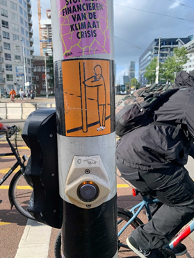
1 — INSTRUCTIONS IN THE TRAFFIC LIGHTS
Amsterdam
Because of the pandemic, stickers were placed to communicate safer ways to push the pedestrian button without touching it with our fingers. It was inclusive in my point of view because the characters were less gender specific, the drawings were simple to understand and legible by using a good contrast between colors. In Architecture and Interior Design there are a lot of dynamics in the space that needs instruction, so why not do it inclusively?
2 — Democracy in the City
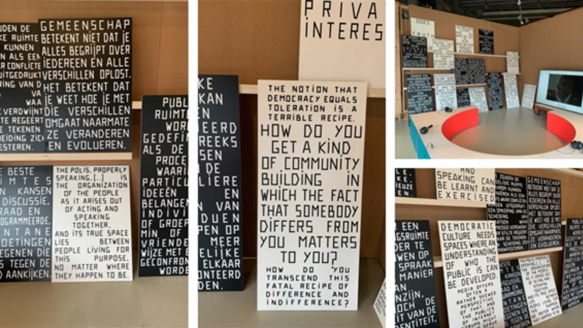
Het Nieuwe Insituut, Rotterdam.
This exposition was about the appropriation of the city by its local and diverse people and the creation of a community in a democratic way. The inclusion is directly related to the design of spaces, in this case, cities, but could be inspiring to residences, companies, shops and so on. It makes us think about how to manage different needs and point of views to build or shape common spaces that are more inclusive, diverse, and accessible to everyone.

3 — Multiple and intuitive space
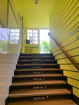
Droog, Amsterdam.
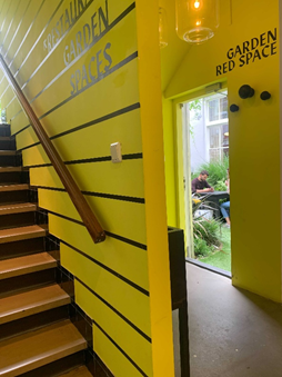
This place is one of my favorite hidden spots in the city. I would define it as an arty cafe, but it is much more than that. They have a gallery, a design shop, a study room, a restaurant/cafe, plus an amazing and recycled garden. The idea of providing different experiences to different needs in the same space is inclusive by itself. Although, I also considered its wayfinding as a good example because it is super simple, clean, and uses shapes, colors, and letterings that intuitively guide you through the space. There is also one problematic aspect of this cool sign, which is the indication of calories lost in each step. It is smart relating to wellbeing, but it can be psychologically painful for people with some diseases or struggling with weight, for example.
4 — Inclusion also means embracing mental health.
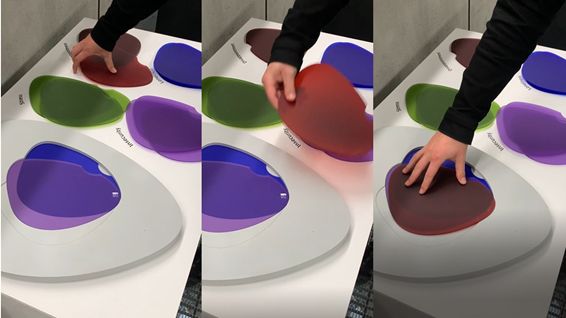
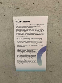
Talking Pebbles, Lucca Kroot. Het Nieuwe Insituut, Rotterdam.
This was an experience about mental health during the pandemic. It consisted of an interactive table with plastic shapes of different colors, each one of them indicating one feeling shared by so many of us nowadays: stress, insecurity, disappointment, and loneliness. Anyone could anonymously create a combination of three of those according to your own pandemic experience. Beyond the fact that colours in the space can impact our mental and physical health, what we can also take from it is the possibility of ludic and gamified experiences anywhere, plus the chance to make everyone feel welcome even with the burdens that might come along with all of us. Could a restaurant, an office, or a school provide interactions like that to improve customers’ and employees’ mental health, for example?
5 — All gender bathrooms and cloakroom areas.
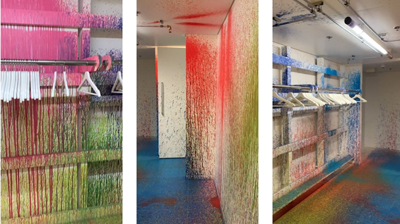
Colour Sprinkles, Rutger de Vries. Het Nieuwe Insituut, Rotterdam.
This example is one of the most direct and self-explanatory pieces about gender inclusion. Toilets have been a part of the architecture that easily challenges the norm concerning these issues. This piece of art welcomes all gender identities when it throws away binary signs and invites every human being to use this functional space without the need to publicly choose a side — that in many cases even represents the real side we would like to take.
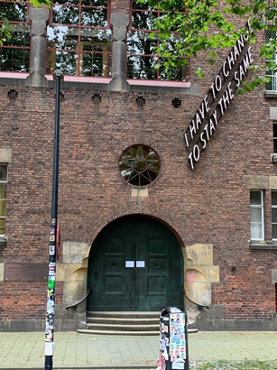
To finish, I will leave this message on a façade in Rotterdam with you, because this is an essential mindset when approaching inclusion: we must see ourselves in constant change to be able to embrace everyone in the best way now and in the future.
