Being of Dutch origin and loving football, I have a natural affection for the colour orange. It reminds me of home and being part of a community. we support the National teams or watch Max Verstappen race his F1 car in Shanghai.
But is your favourite colour also the best to use in your logo, web design and other ways of marketing your new product? Most people make the mistake of just following their own preferences in designing their brand colours. Most go without knowing what impact it may have on the success of their product. There is a trend in China that more millennials are eager to work independently and start their own business. They want to be in charge of everything they do, so what better way than just becoming the boss? Below I want to outline how colour management can influence consumers’ behaviour and make a positive impact on your brand.
The psychology of colour
Besides the font and shape of your brand, colours will influence the way people perceive your brand. It will make them decide whether they will like it or not. According to Colourfast, 93% of purchasing judgements are based on visual perceptions. While 84.7% of consumers say that colour was their main reason for purchasing a product. And the thing in charge of this is the amygdala; a small seahorse-shaped structure within our brain.
Also, the user’s attention span of a product has decreased dramatically. It went from 12 seconds in 2010 to only 4 seconds in 2014. Living in the year 2022 now you can imagine that the attention span is really just a matter of second(s). More than ever, first impressions count!
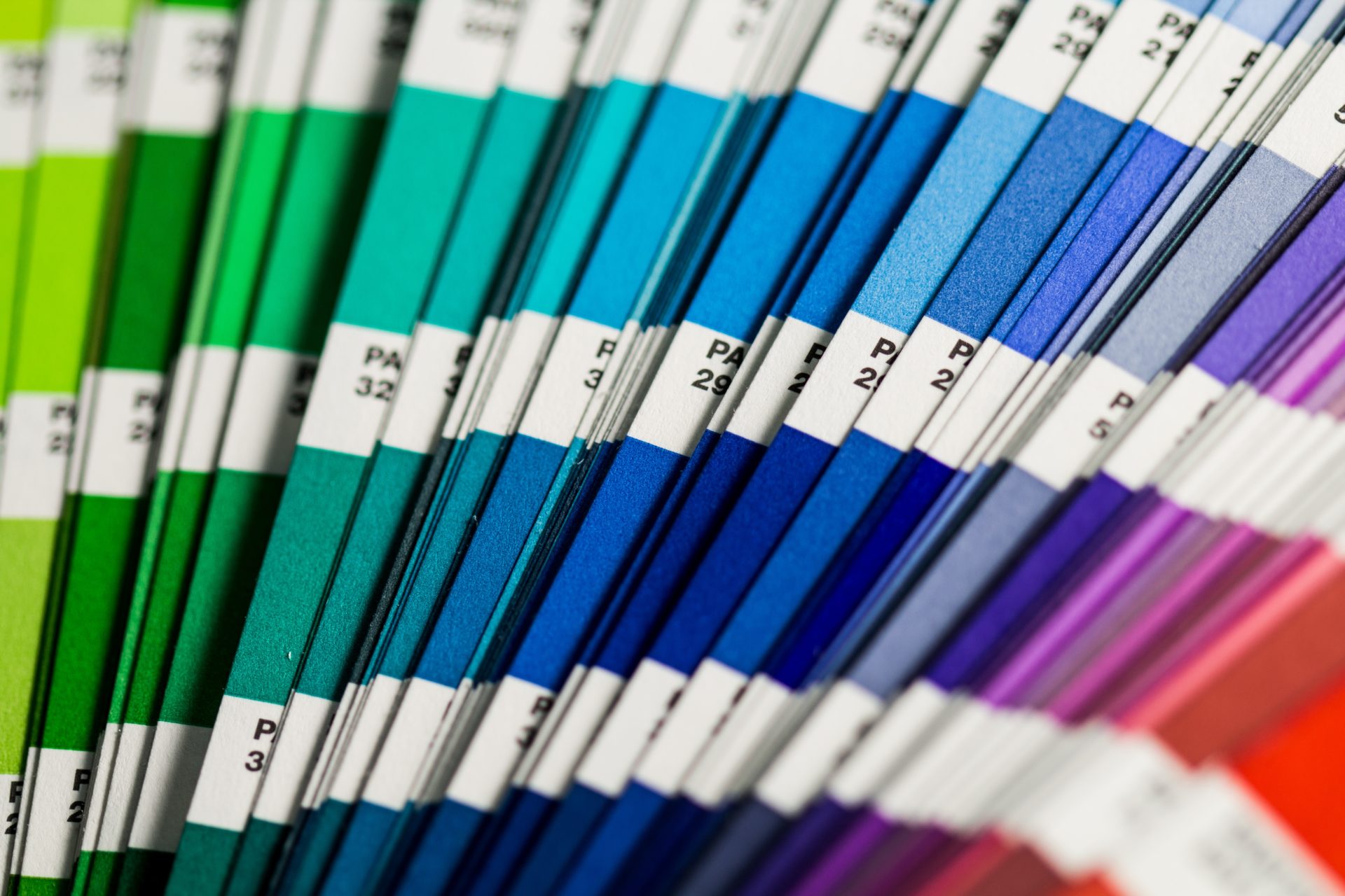
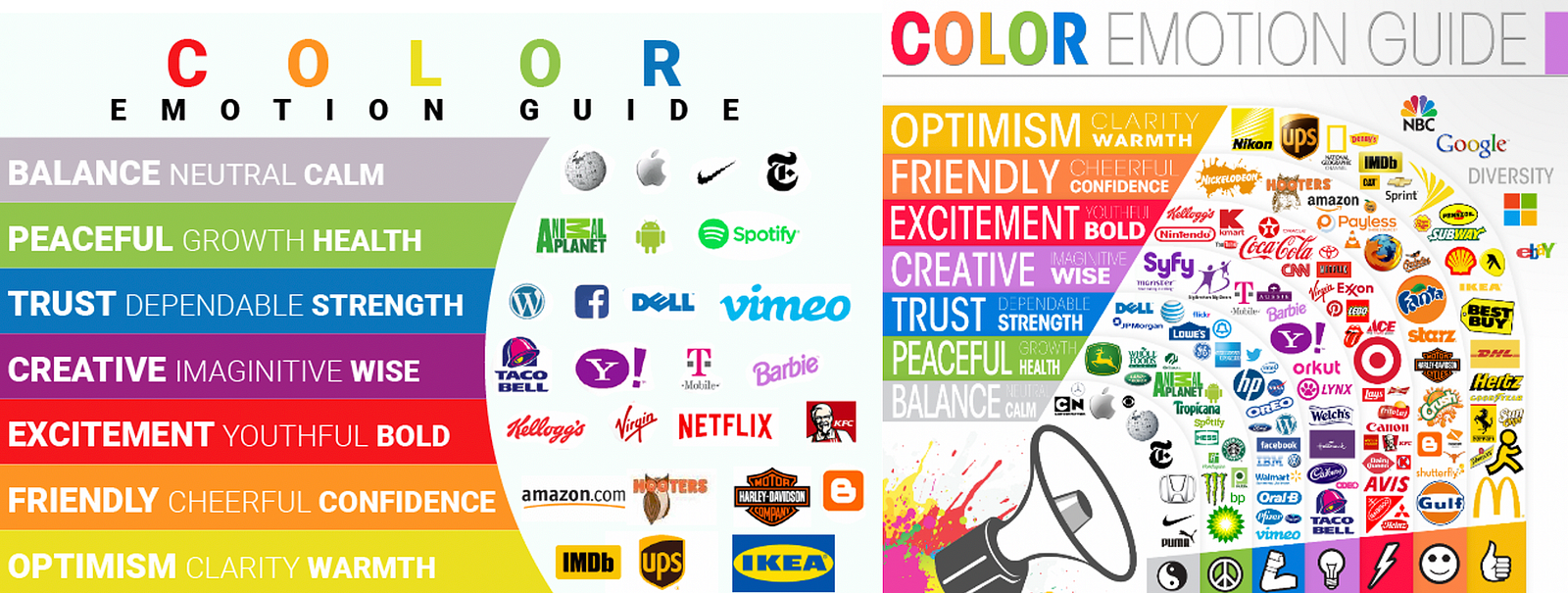
Looking at the Color Emotion Guide, it is important to decide what message you want to convey to your audience. You want to “lock” them directly. First, decideupon your philosophy and mission statement. Then, it is best to choose the colour that matches your objectives most.
Besides the psychological impact of colours, we still need to keep in mind the cultural influence as well. When I just started working in China, I was a Brazilian Churrascaria Restaurant Manager. One day we had a Brazilian national day promotion and to make it more attractive for our guests. we decorated the restaurant with more Brazilian flavoured decoration. Also, as part of the festivity, we organized green and yellow caps for the Chefs to wear. When handing them out, one of the chefs got very angry and strongly refused to wear the cap. We asked people and found out what the issue was.when men wear green caps in China, they have been cheated on by their wives!!!
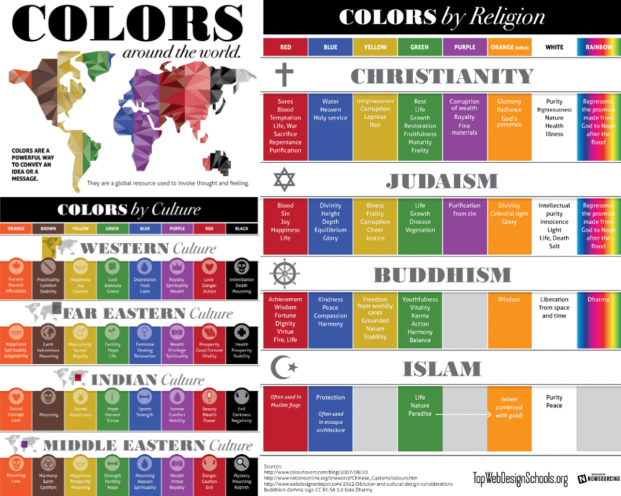
Therefore, it is extremely important to carefully consider your design, especially if you want to expand internationally. As can be seen from the below chart, different cultures have different meanings for certain colours. The chart does not only cover regional perceptions; even religions have different understandings when it comes to colours.
https://brandongaille.com/what-colors-mean-different-cultures/
Conclusion
According to marketing industry influencer Krista Neher, the human brain processes images up to 60,000 times faster than words. Put that together with the fact that people make an aesthetic decision about a design within 17 milliseconds. As a comparison, a blink of an eye takes at least 150ms.
So, if you want to be truly successful in the long term, it is better to choose those colours that are timeless and tickle your amygdala!


